Sunday, October 10, 2010
Choosing and Using Color, Part 3
I love this room by designer, Alexandra Rae of Alexandra Rae Interiors that I found on a fun blog I follow, The Green Door. I often use greens in a room. In fact, this posting could be subtitled the magic of greens. Green is a fabulous color because it can go warm or cool depending on it's base. Did you know that green is actually a neutral? By this I mean it goes well with literally any other color. If you use it with contrasting reds and oranges for accents...they will literally "pop". Or, try it with aquas or rich blues for a more tranquil palette. With that kind of versatility, you can go in almost any direction and have it look good.
Also, almost any green will go with another green. Try mixing olive with emeralds or celadon. If you look at nature you will see how well this works. In fact, mixing them just seems to make them more interesting. The other wonderful thing about green is how fresh it can make a room feel, especially when you introduce it with foliage such as trees and plants. It literally seems to bring the outdoors in and opens up the room.
In Feng Shui green is associated with spring time and represents new beginnings. It is the balance between the mental and the physical. It is also associated with growing wealth...now who doesn't like that?.
So if you are still undecided about choosing a color for that room...try going green. I may be the perfect solution!
Wednesday, October 6, 2010
Choosing and Using Color Part 2
Check out any fashion magazine such as Elle.com (featured above) and you will get an indications of the new color trends. And, just in case you have not been following the New York fashion shows for Spring 2011, all you who love color will be in for a pleasant surprise. Yes, the runways are awash with brilliant color! Everything from vibrant yellows, raspberry reds, corals, purples, bright pinks and turquoises. This colorful palette is intermixed with a large swath of black and whites, beiges, browns and grays. To see more you can check out Style.com and see designer John Galliano's generous use of color in his spring collection.
You may be asking, "Why should I care...I am not a trendy sort so I haven't the slightest interest". You would be very surprised to discover how much of our lives are dictated by the fashion industry. In fact, if you do not buy one article of clothing in the next year (which I seriously doubt), you probably will be buying an appliance for your kitchen, tableware, home accents, paints for your wall, or a few of you lucky ones, a new car. The truth is that the colors and styles dictated by the fashion industry will filter down to every major department in every major department store including WalMart and Target. Have you ever tried to find some bedding, for instance, to match a color scheme from a few years ago only to discover it is almost impossible? I assure you that this is by clever design of the fashion/color gurus.
So, if you are planning on updating or redecorating in the coming year, you may want to take this into consideration. This does not mean that we all have to follow along like good soldiers, there is room for individuality, but good luck with trying to find furnishings and accents in unique choices of color. In any event, the die is cast, and these will be the colors you will see for the new year. So, bottom line, unless you want to expend the extra energy swimming against the current it would be a good time to do a little research before you choose that paint color.
To sum things up, brights in yellow, corals, oranges, pinks, blues, and purples are definitely "in". Oh yes, and for all you animal print lovers...looks like they will still be around for some time only now they are doing them in the bright colors as well. Looks like ruffles, large prints and retro are also very big and although I am not exactly sure how many ways that will translate to the interior design industry, rest assured that it will.
Just thought you would like to know. Have fun decorating!
Tuesday, October 5, 2010
Choosing and Using Color
What goes with what? How do I choose the paint colors for my home? What colors should I avoid? These are all questions I often hear. Color is the most important of all the elements in decorating, the least costly and often creates the most dramatic change. Color is also a great way to set a mood. It has been proven that we all have emotional reactions to certain colors and definite color preferences. In fact the visual stimulation of color can cause emotional, psychological and physiological reactions.
Color has three dimensions: hues (the actual color or pigment), relative values (as illustrated above right...light to dark) and intensities (degree of saturation of the pigment or pure color). An important thing to remember when choosing color is that color can reflect or absorb color depending on how light affects it. Without light there could be no color. The lighting in a room can have a tremendous affect on a color. Therefore, always select your color choices in the actual room where it will be used. Never depend on how it may appear in the paint store!
Before I go any further, keep in mind that this is a very basic primer for choosing color. Truth be known, I could spend months on the subject and still not cover it all. That said, I am hoping this will be enough to get you started on your journey.
So where should we begin? I recommend reviewing the time tested color wheel. Perhaps you recall learning about the color wheel in school. You know, primary colors of red, yellow and blue and secondary colors of yellow, orange and green. Basically these primary and secondary colors are divided into warm and cool colors. The warms are the reds, oranges and yellows and the cools are the blues, violets and greens. Therefore, they can help to create a warm or cool atmosphere to the room. It is important to note however, that you can create a warmer blue or green, for instance, by adding a yellow base or a cooler yellow by adding a blue base and so forth. The wonderfully bright and uplifting "Quince" touted in House Beautiful's September issue is a good example of a warmer green. Therefore there is some cross-overs to consider. Bottom line it is important to determine the "temperature" of the room before you select your color. If it seems to cool go for warmer colors and vice versa.
Here are some simple ways to create a color scheme for a room. Basically, there are two schemes. Related or harmonious schemes or colors adjacent to one another on the color wheel. An example of this would be yellows and oranges, blues and greens, reds and blues, etc or several hues of the same color moving from lights (even pale off whites) to deeper shades. These combinations are usually easy, natural and comfortable to live with just as the name "harmonious" implies. The use of one color in several hues is called monochromatic. Also the non-color combination of black, gray and white would be included as a monochromatic scheme. Monochromatics are very popular right now, especially in the natural colors like grays, creams and beiges. You may have noticed some of the trendy ads for Restoration Hardware, or Arhaus in recent design magazines. The use of monochromatics tend give the room a more sophisticated look. The wonderful new "natural" wallpapers are great to use in combination with this color scheme to add interest and texture.
The second is the contrasting or complimentary scheme. This scheme is loved by designers because it has more variety and drama. These are the colors lying directly across from one another on the wheel. If they are of the same intensity, when placed side by side, each makes the other seem more intense. For example, orange seems more orange if it is placed against a blue wall. Contrasting color schemes will always be a combination of warm and cool colors since they are opposites on the color wheel. They can be lively or restful depending on how much they are "grayed" down. When used 50/50, they can clash and cause an uneasiness to the room. It is therefore important to choose only one color to be dominant with the other(s) taking a secondary role as accents.
Again, to review, we respond to color on many levels. The main color of a room can affect your mood or emotions. Bright and bold color such as red can stimulate action, whereas a soothing, cool color such as blue can be very relaxing. You may have noticed that fast food restaurants tend to use the opposite schemes of the more exclusive restaurants. If a color you love is particularly strong or dark you may want to consider using it as an accent only. If for instance, you are having problems getting a child to settle down for the night...take a second look at the color scheme in his/her room. The same is true of yours. Remember your bedroom is the first and last thing you see and experience every day.
Another thing to remember is to keep the color scheme "flowing" from room to room to avoid that "patch-quilt" effect. Keeping a nice flow adds to the serenity of the home and also can make it feel more spacious. You can introduce new colors in rooms, just keep them in harmony with one another. It is also a good thing to have at least one color in common to lead you from room to room be it as a dominant or an accent.
When selecting colors from paint swatches take note of the base, keep in mind that a yellow base will bring more light into the room. My experience has been that most rooms need more light and this is a wonderful trick to do that. A red/pink or blue base will soak up light thus making the room feel gloomy or dark.
One last comment on choosing color schemes...don't forget the ceiling! it is the 5th wall of the room and too often overlooked. It may be a great opportunity to add some extra drama or coziness to a room. Pure white ceilings tend to add starkness to a room. This is especially true if you are using warm or wood tones on the walls and floors. In this case I would definitely recommend choosing a white from the warmer category.
That's all for now...good luck and have fun! Please feel free to email me or leave a comment if you have any questions.
Sunday, September 26, 2010
Fall Decorating on a Budget
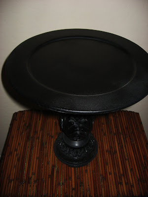
Looking for a dramatic fall centerpiece for your table or entry? Here is a fun idea. Start with a large black cake pedestal to give it some height and drama. You can find them on line for purchase. I actually found one similar to the one I made listed for $80! If you live on a budget like me, you can follow these easy instructions and make your own. The total cost of mine was $8 plus my spray paint...so as you can see that was quite a savings!
Basically you need a large round tray or plate and something for a base. True to form, I browsed the thrift stores for these items. As a matter of fact, I actually purchased mine at a local thrift store yesterday. The plate, which was a pretty ugly silver painted charger plate, cost me $1.99. For the base I love to use my imagination because actually anything goes. If you want to keep it simple, a large candlestick is probably the easiest source. Believe me, you can find all sorts of them if you are looking for one. You may already have one in in your storage. Mine cost only $5.99. Is there any question why I love to shop thrift stores?
Clean both pieces of extra dust and oils and then spray lightly with a primer paint. This may seem unnecessary, but the final product will have a much nicer finish when you use a primer and it will be less likely to chip. Then, for a Halloween or fall arrangement I like to use a matte or flat black spray paint. You can use a satin finish, but anything glossy will take away from the focal point of the arrangement. When both pieces are dry, glue them together with a good household glue. I like epoxy as it holds up the best.
The key to an interesting centerpiece is thinking in terms of levels...ie, lifting the eye up from the base or tabe to the top of the arrangement. This is why the cake pedestal works so well.
I have included two pictures of very easy, quick arrangements I that I pulled together with just the things I had around from previous years. I used artificial pumpkins, but real ones would work beautifully. Personally, I think my looks every bit as good as the expensive ones on line. The important thing is to just have fun and enjoy the challenge...
Monday, September 20, 2010
Sack Cloth and Ashes?
Remember this old saying? Well, sack cloth is not what it used to be! Today, vintage sack cloth is selling for the high dollar. As an example check out several listed on Ebay. In fact, they made the "it" list with Horchow. These are great to use decoratively as I have in my kitchen photo above, or stitched up for decorative pillows as with the Horchow Collection, framed for wall art, etc. Works great for a beach house, country or rustic decor. I would love to get some feedback from you on other ideas as well.
If you sew at all, you are only limited by your imagination and your budget. I love to check out the thrift stores (where I found mine) or antique shops. If you are lucky, you may already have one stashed away in the attic. Any way you do it you can be sure it will be a one-of-a-kind treasure...and you created it yourself! Happy hunting!!!
Monday, September 13, 2010
Chocolate of the Gods Mousse Recipe
For all of you who wanted the recipe...here it is. I got this one from House Beautiful magazine several months ago but Whole Foods has a similar version.
2 C Hass avocados (about 2)
1/2 C plus 2 T pure maple syrup
2-4 T Organic/raw sugar
2 T Coconut oil (optional)
1-2 t Vanilla extract
1 t Sweet balsamic vinegar (Costco brand ok...aged is best)
1 C Pure cocoa powder...I use the extra dark
1 pt Raspberries (fresh or frozen)
Handful of fresh mint...chopped
Top with whipped cream if desired...
In a food processor, blend the avocados, maple syrup, sugar, coconut oil, vanilla and balsamic until smooth and creamy.
Add the cocoa powder and blend until smooth. Use a simple metal strainer if you have any lumps.
Distribute half the raspberries evenly among four to eight dessert bowls. Follow with a dollop of mousse, sprinkle of mint, more raspberries and top with whipped cream if desired.
Leftover mousse can be stored in a tightly sealed container for up to a week in the frig or frozen for up to a month.
Here's to your health!:-)
Thursday, September 9, 2010
First Impressions
First impressions are important in everything and certainly our home is no exception. While skimming through some photos from my favorite magazine, Veranda, I came upon this Spanish Colonial Revival style Bougainvillea entrance by designer Kathryn Ireland. Notice how her choice of aquas for accent allow the pinks of the flowers and the red of the walkway "pop".
When choosing colors for front doors it is important to decide what you want the focus to be. If it is to be the door then go for bold color. Personally, I am always a sucker for a beautiful shiny red door for example. If, however, as in this instance, you want to calm down other colors already present at the entrance go for something more soothing such as aquas or blue tones. Black or deep purples would also be a good choice. Black doors add a stately elegance to your entrance like no other color.
Note too the pull cord on the bell and the lantern light which add unique interest and help to balance out the heaviness of the Bougainvillea on the opposite side. The pots are the final touch to anchor the door. They are also a great way to reintroduce the beautiful aqua color used on the door. These pots are quite large. Anything smaller would be lost in the scale of things. When you are working with large heavy vines and trees it is important to keep the scale of your accent pieces in proportion. Notice also that the pots are empty so as not to compete with the Bougainvillea vine. Anything more would be too much. Definitely in this case the Bougainvillea deserves most of the attention!
One final caution. If your door is not pristine to begin with, you may want to choose a finish less glossy such as an eggshell. High gloss finishes are gorgeous when applied carefully, but will show each and every divot and imperfection. Make no mistake, a satin finish still has quite a bit of shine but may be a good compromise if you are feeling uncertain about your choice.
Subscribe to:
Posts (Atom)